|
|
|
|||||||||
|
|
|
|
|
|
||||||
 |
|
|||||||||
 |
 |
|
||||||||
|
|
|
|
|
|||||||
|
|
||||||||||
|
|
||||||||||
|
|
||||||||||
|
|
|
|||||||||
|
|
||||||||||
|
|
|
|||||||||
|
|
||||||||||
|
|
||||||||||
|
|
||||||||||
|
|
||||||||||
|
|
||||||||||
|
|
|
|||||||||
|
|
||||||||||
|
|
||||||||||
|
|
||||||||||
|
|
||||||||||
 |
|
|||||||||
|
|
||||||||||
|
|
||||||||||
|
|
||||||||||
|
|
||||||||||
|
|
||||||||||
|
|
||||||||||
|
|
||||||||||
|
|
|
|||||||||
 |
|
|||||||||
|
|
||||||||||
|
|
||||||||||
|
|
||||||||||
|
|
||||||||||
|
|
||||||||||
|
|
||||||||||
|
|
||||||||||
|
|
||||||||||
|
|
||||||||||
|
|
||||||||||
|
|
||||||||||
|
|
||||||||||
|
|
||||||||||
|
|
||||||||||
|
|
|
|||||||||
|
|
|
|||||||||
|
|
|
|
|
|
|
|
|
|
|
|


|
In the exhibit text of a 2018 exhibit in Chengdu, I made this statement about my t-shirt designs: As for the t-shirt designs, this started because I became dissatisfied with the designs on offer in major retail outlets both here in Chengdu and in the US. In the US, more and more I find that printed apparel consists largely of pop culture iconography and corporate branding. More specifically, (1) images from pop culture movies, TV shows, cartoons, and computer games, (2) images from major national and university sports teams, (3) corporate logos and brand recognition designs for both current and dated consumer products, and (4) dated advertisements for far flung destinations that the buyer and wearer likely have not visited. I believe printed apparel should have some genuine reflection on the character of the person wearing the clothes. I remember fondly the No Fear t-shirts that were very popular in the US in the 1990s and 2000s. They were bold, existential, deeply meaningful, motivational, and both rebellious and virtuous. I also appreciate that No Fear was very successful without celebrity endorsements. For me, they represented a meaningful non-pop pop cultural iconography that I believe was very interesting and engaging. Unfortunately, No Fear went bankrupt in 2011. In Chengdu, I find that many people who wear printed apparel are not very interested in knowing or understanding the messages on the clothing they are wearing. I find this surprising. Interestingly, I have observed a long-standing but smaller trend in the US where people will wear or display Chinese characters which they often either don't understand or misunderstand. In both the US and China, distressed or what I call "fake old" clothing seems to be very popular. In the US, the "fake old" style is frequently combined with designs featuring dated subject matter. Distressed denim clothing seems to have started with an attempt to imitate heavily worn clothing but has since become more disassociated in its approach. I dislike the "fake old" and distressed fabric style because it does not seem genuine to me. The origin of my t-shirt designs is my own character, expressed genuinely but within the pop culture format of a graphic t-shirt. Beyond this framework, I am still exploring. One area of exploration is disclosure. How much can I disclose about my own character without causing offence or burning possible bridges? Another area of exploration is accessibility. How important is it for others to understand the message on a t-shirt? |
|
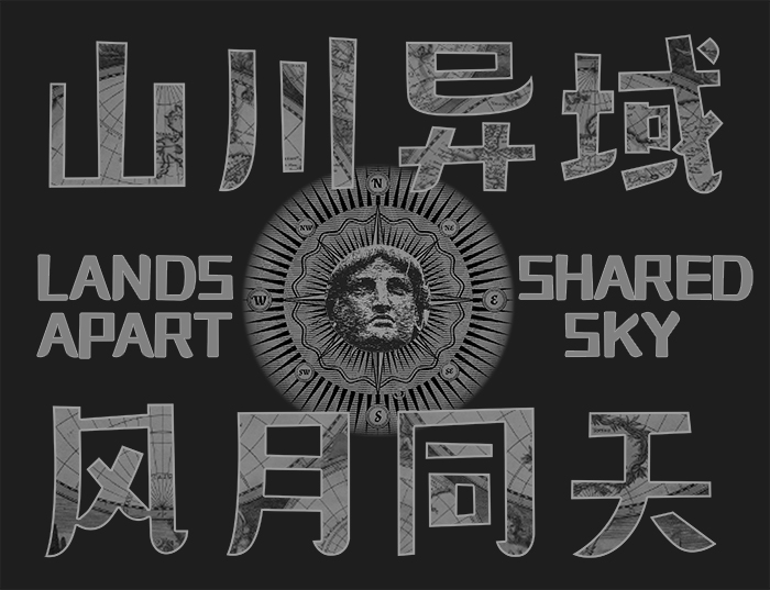
T-Shirt Design John Theodore Weller 2020 This design was ispired by Japanese shipments of n95 masks to China during the 2019-2020 coronavirus epidemic. A Quartz article summarizes the situation well and can be viewed here: https://qz.com/1796494/china-internet-users-praise-japan-for-coronavirus-response/ |
|
|
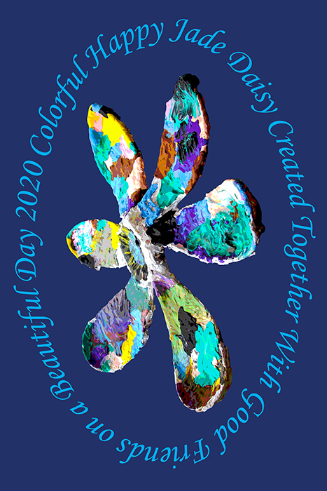
T-Shirt Design John Theodore Weller 2020 My son attends kindergarten at Jade Learning House, and he is in the "Daisy" class. As a group, the children made and colored a huge daisy together. The finished piece was exhibited in their Spring Festival art exhibit. I used a photo of the exhibit to create this t-shirt design. |
|
|
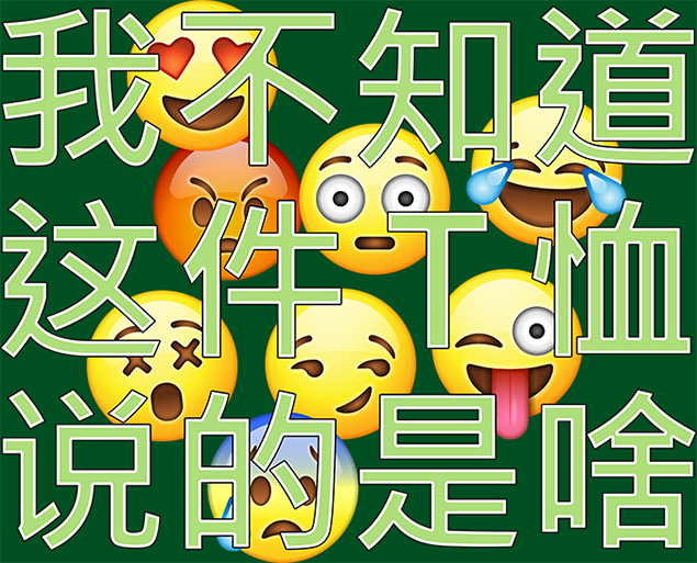
T-Shirt Design John Theodore Weller 2020 This text translates to "I don't know the meaning of this t-shirt". |
|

|
T-Shirt Design John Theodore Weller 2017 |
|

|
T-Shirt Design John Theodore Weller 2019 I made this design because I remember a similar design that existed many years ago. Today, however, it seems only "fake old" or "distressed" text designs are available for Hollidaysburg (my hometown) shirts. |
|

|
T-Shirt Design John Theodore Weller 2016 |
|
|
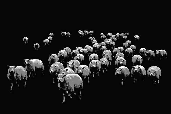
T-Shirt Design John Theodore Weller 2019 |
|

|
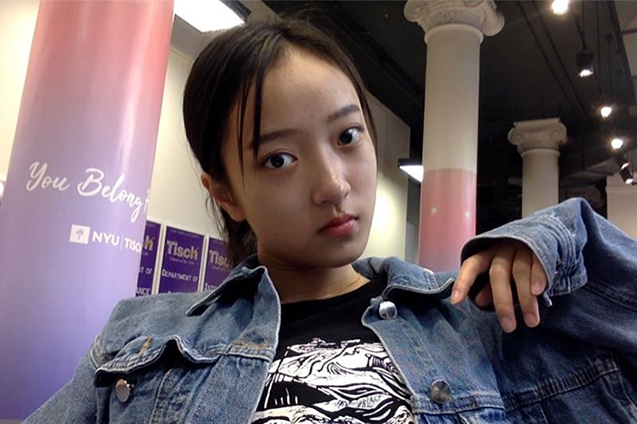
T-Shirt Design John Theodore Weller 2017 This woodcut design was created by Sophia, a Grade 10 student, and I converted it to a t-shirt design (white on black instead of black on white). |
 |
|

|
T-Shirt Design John Theodore Weller 2016 "Huzi" is the pinyin spelling for the Chinese word for beard and "Duzi" is the word which means belly. |
|
|
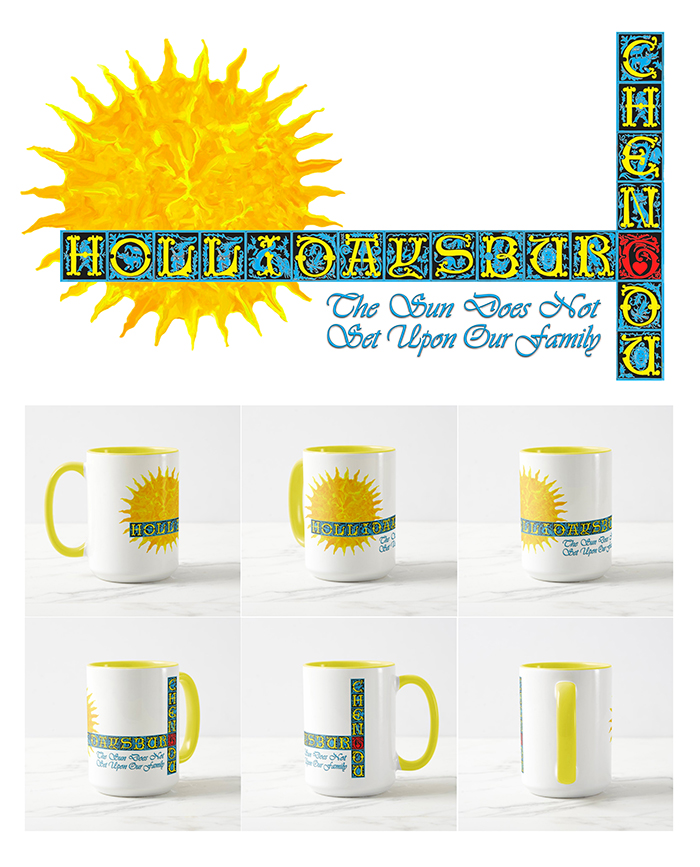
Mug Design John Theodore Weller 2021 We have family in both Hollidaysburg, PA and Chengdu, China. |
|
|
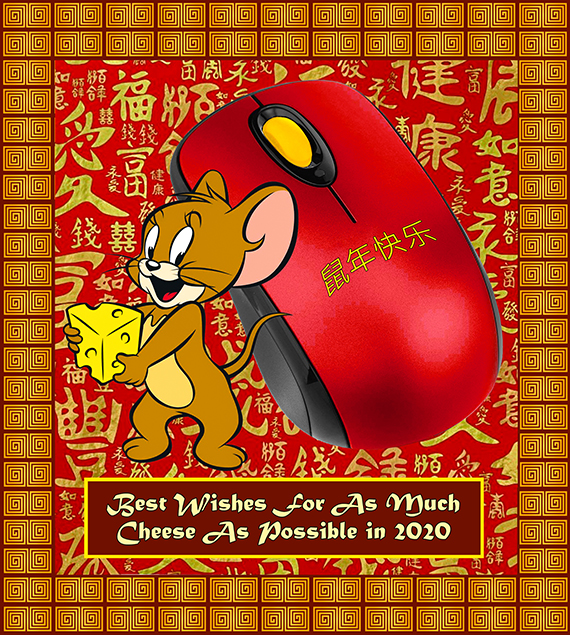
Meme Design John Theodore Weller 2020 2020 is the year of the rat, or mouse, in the Chinese calendar. |
|
|
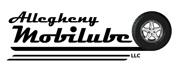
Branding Design John Theodore Weller 2010 This was made for a startup company supplying mobile servicing to fleet vehicles. |
|
|
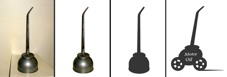
Branding Design John Theodore Weller 2010 In the process of creating the above design the client wanted to see an oil can on wheels. This was the comp design to meet the client's request. |
|
|
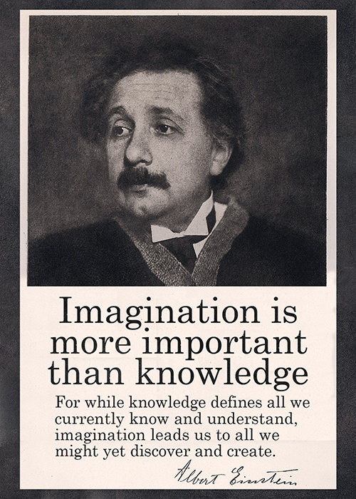
Poster Design John Theodore Weller 2011 |
|

|
Web Design John Theodore Weller 2001 Web design for a US minor league baseball team. |
|
|
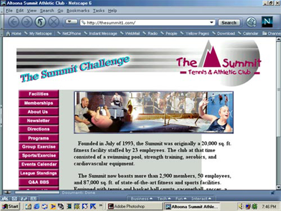
Web Design John Theodore Weller 2001 Web design for a health club. |
|

|
Web Design John Theodore Weller 2001 Web design for a Catholic diocese. (Remember the old Netscape GUI and the 800-point screen resolution?) |
|
