|
|
|
|||||||||
|
|
|
|
|
|
||||||
 |
|
|||||||||
 |
 |
|
||||||||
|
|
|
|
|
|||||||
|
|
||||||||||
|
|
||||||||||
|
|
||||||||||
|
|
|
|||||||||
|
|
||||||||||
|
|
|
|||||||||
|
|
||||||||||
|
|
||||||||||
|
|
||||||||||
|
|
||||||||||
|
|
||||||||||
|
|
|
|||||||||
|
|
||||||||||
|
|
||||||||||
|
|
||||||||||
|
|
||||||||||
 |
|
|||||||||
|
|
||||||||||
|
|
||||||||||
|
|
||||||||||
|
|
||||||||||
|
|
||||||||||
|
|
||||||||||
|
|
||||||||||
|
|
|
|||||||||
 |
|
|||||||||
|
|
||||||||||
|
|
||||||||||
|
|
||||||||||
|
|
||||||||||
|
|
||||||||||
|
|
||||||||||
|
|
||||||||||
|
|
||||||||||
|
|
||||||||||
|
|
||||||||||
|
|
||||||||||
|
|
||||||||||
|
|
||||||||||
|
|
||||||||||
|
|
|
|||||||||
|
|
|
|||||||||
|
|
|
|
|
|
|
|
|
|
|
|


|

|
|
| Grade 12 & Grade 11 | Grade 12 & Grade 11 |

|
Self-Portrait 40 cm x 50 cm Oil on canvas Sophia Zhang Grade 11 2017 |
|
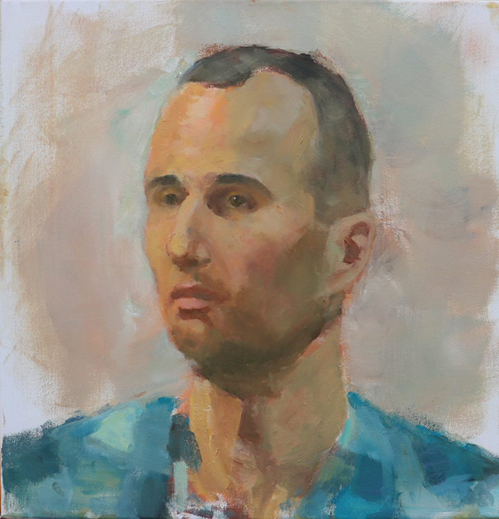
|
Portrait of Mr. Varga 40 cm x 50 cm Oil on canvas Sophia Zhang Grade 11 2017 |
|

|
|
|
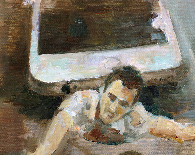
Inferno Oil on canvas 60cm x 80cm Sophia Zhang Grade 11 2017 |
I intend to show the isolation between people created by excessive use of electronic devices. I create a mysterious atmosphere by connecting to the dark forest at the beginning of Dante Alighieris Inferno. Influenced by Salvador Dalis The Persistent of Memory, I separate depth into levels which represent the levels rising upward from hell. Full and detail views shown |
|
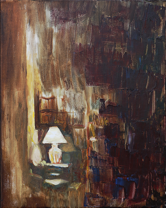
Midnight I 40cm x 50cm Oil on canvas Sophia Zhang Grade 12 2018 Everything has changed color at night and familiar scenes become unfamiliar and special. I use a divisionist technique which is influenced by Georges Seurat and a pallet knife technique influenced by Lenoid Alfremovt to de-familiarize objects. |
|
|

|
|
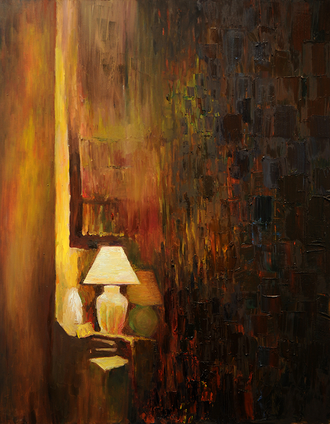
Midnight II Oil on canvas 120cm x 150cm Sophia Zhang Grade 12 2018 | Midnight II is more immersive because of its size and because of its extra exaggerated texture with impasto layers of small brush strokes transforming into large and thicker strokes made with the pallet knife to show the gradual disappearance of light. People can be more immersed in the painting because of its size and more immersed in my process by seeing both Midnight I and Midnight II together as they are placed in my exhibit. Full and detail views shown |
|
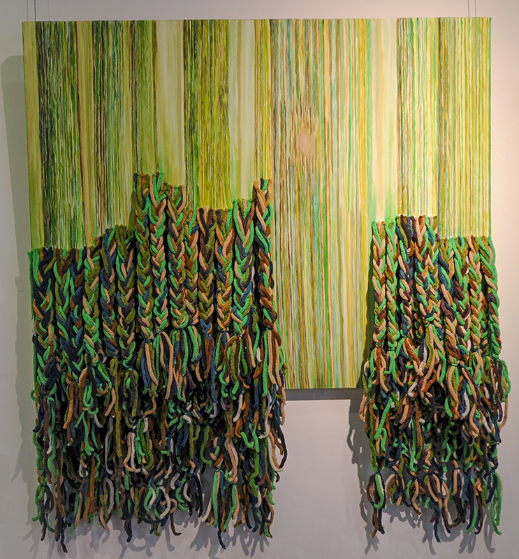
The Forest 100cm x 80cm Oil and yarn on canvas Regina Xu Grade 12 2018 Females usually have many thoughts in their hearts but won't say them out or show them directly, so people cannot understand them. My lovely forest represents females because women are like the trees and vines in the forest. People cannot easily see through to their center and heart. In Notre-Dame-de-la-Garde (La Bonne-Mère) MarseillesI, Paul Signac used the color points to make the artwork. So I use the basic element lines to build a forest that is very thick. |
|
|
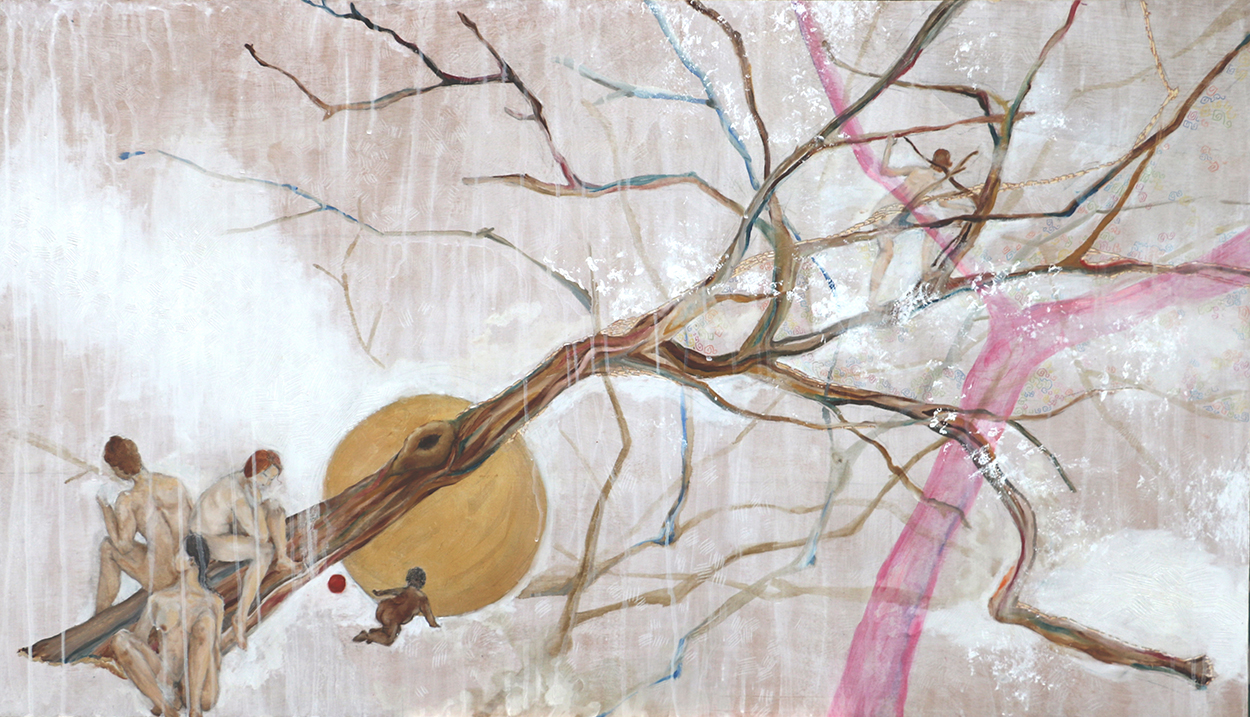
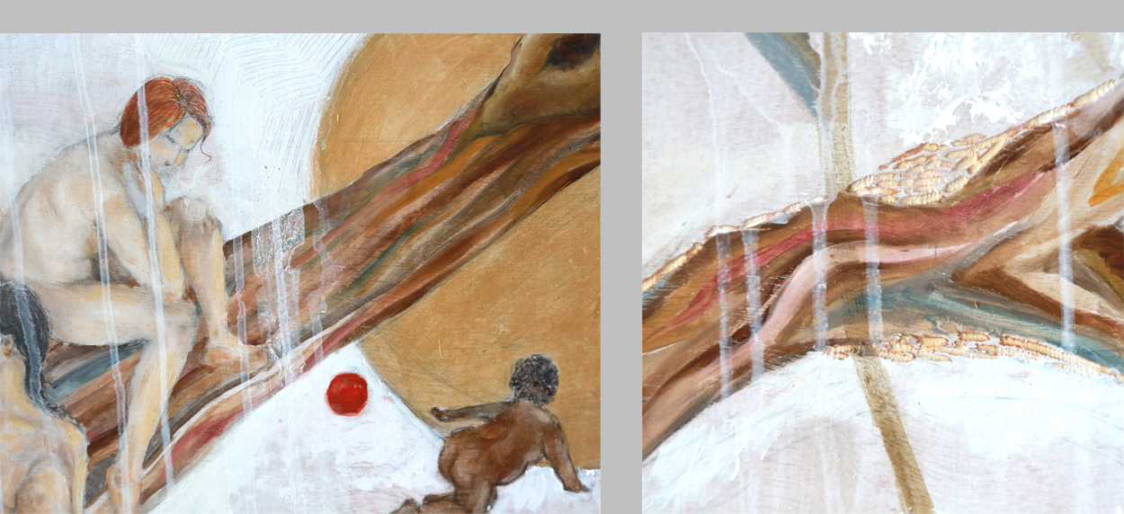
In the Field Oil and gesso on carved wood 140cm x 80cm Karmen Guo Grade 12 2017 Aloneness might make people be more successful in their career by adding focus to work. The artwork was influenced by Alexander Calders use of lever principle in his artwork Gibraltar, to discussing emotional term in an objective manner. Field is a polysemy, it can both mean work fields (career) and land. The artwork has used the multi-meaning of the word as an implicit meaning. Detail views shown below |
|
| ||

|
Hide and Seek, part of the The Nature of Aloneness series Oil on canvas, fabric 60cm x 80cm Karmen Guo Grade 12 2017 Aloneness is a paradox of humanity. People want to resonate with others, yet people need privacy. The artwork is an interactive artwork. Viewers are invited to move the curtain. This arrangement makes viewers action to be part of the artwork. The style of the artwork is influenced by Sanyus combination of the use of Chinese classical poetic format (a special combination of stillness with action) and the human figure, also incorporating classical Chinese use of graceful curve and light value. |
|

|
Let's Go for a Walk Woodcut printmaking, watercolor, cut paper, shredded paper pulp Karmen Guo Grade 11 2016 People are not alone since their soul accompanies with them. The artwork is influenced by pointillism. The artwork uses repetition with different media which is also unity with variety to express the idea of never being lonely. It is a cropped person and their reflection on the beach. |
|
|
 |
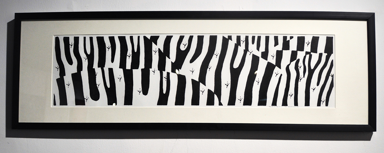
Peck for Me, Peck for You 20cm x 80cm Woodcut printmaking Emiri Fujimoto Grade 12 2018 |
The zebra and the oxpecker bird enjoy a mutually beneficial relationship. The bird removes skin parasites from the coat of the zebra, and relieves the zebra's discomfort, and the bird gets a tasty meal. The use of stamping on top of the woodcut print suggests a bird walking on the landscape-like zebra. Behaving according to your own self-interest can be beneficial to others. The manipulation of subject recognition is influenced by Catherine Murphys "Comforter". |

|
|
|
|
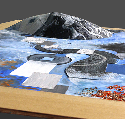
Double Prey Gouache, acrylic, leather, wood chips, paper towel and newspaper on paper on wood Bing Ke Doris Liu Grade 11 2015 The snake who eats too much can die from its own greed. Animals can be metaphors of human natural qualities that are hidden by our social identity. This work shows peoples material desires through exploring a relationship of hunting and being hunted. Autumn leaves are a Chinese symbol of wealth which enhances the expression of people's desire for money. The actual three-dimensional form within the two-dimensional format emphasizes the greed. The use of symbolically tattooed animal forms was inspired by Xiang Jings "Otherworld - Will Things Ever Get Better?" Full view and alternate detail view shown above |
||

|
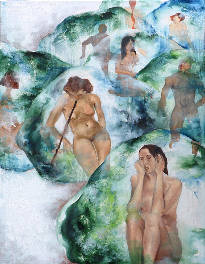
The Womb 80cm x 130cm Oil on canvas, batik, tie-dye and embroider lines Bing Ke Doris Liu Grade 12 2016 Baby being in mothers womb is a metaphor to reveal the false sense of safety that can be produced when people are in a situation with sufficient material supports. Embroider lines were used to build the association of umbilical cord, which enhanced the expression of my objective. The use of a wrapping element as a strategy for expression -- in this artwork, being wrapped in the womb -- was influenced by the ceramic artist Georges Jeancloss "Kamakura". Notice wrapping is also used as a strategy for expression in the above artwork, "Double Prey", as the large prey is wrapped in the stomache of the snake. Full view and detail view shown at left |
|
|
Cages 70cm x 90cm Oil on canvas, modeling paste Bing Ke Doris Liu Grade 12 2016 A cage that can make you suffocated but also can be broken by your one finger touch. This is a type of self-imposed self-abasement common to humanity. It is created by ourselves around ourselves. As with the previous two works, the use of the wrapped object as a strategy for expression is inspired by the work of Georges Jeanclos. The concept of self-imposed self-abasement is informed by Alfred Alder's book "What Life Should Mean to You". |
|
|

|
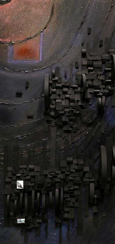
Blessed Oil painting and EVA board on canvas Geosiiy Zhang Grade 12 2019 This is the interior of a shower. Privacy brings security to people. The whole artwork contains darker colors and abstracted objects, such as the window in the upper left corner, or the scattered and fragmented human figure in this picture. When people tolerate too much, they might want to escape from the real world and blend into darkness piece by piece, that no one could find them anymore, to be much safer than before. Full view and alternate detail view shown |
||
|
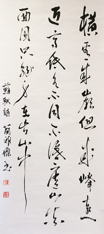
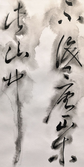
Calligraphy 60cm × 165cm Lannie Lan Grade 12 2019 Chinese traditional calligraphy written in a traditional running script character style. The style is influenced by Wang Xizhis Orchid Pavilion. The content is a poem named Ti Xi Lin Bi written by Su Shi which describes the changeable features of Lushan Mountain and points out that the observation should be comprehensive. If the subject is one-sided, the conclusion will be incorrect. Which serves the objective--instead of being exclusive, extreme contrasts can be co-existing. |
|

|
|

|
|
a.k.a. Calligraphy 60cm × 165cm Lannie Lan Grade 12 2019 This is a calligraphy work. I use the same style, material, content and stamp as my Artwork 4, Calligraphy, excepting I add water when I am writing on the calligraphy to create bleeding of the ink which is only semi-controlled. In Chinese conventional ideology a calligraphy work should avoid bleeding. After studying Marcel Duchamps Fountain, and after challenging naturalism in Artwork 2, I want to challenge the meaning of calligraphy, to show bleeding ink can be expressive and add an extra layer of expression, which is a function, to the calligraphy. |
|
|
|
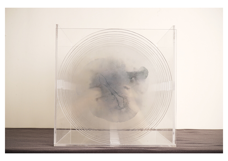
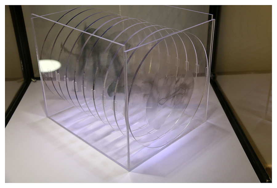
Grey Space 25cm × 25cm × 30cm Acrylic plates and display box manufactured by Aolis Co. Lannie Lan Grade 12 2019 Bleeding ink is considered as an error in Chinese Calligraphy. However, I believe error is not only destructive and ugly but constructive and beautiful. I show bleeding ink can add an extra layer of expression to the calligraphy which adds beauty. As more plates overlap, the more gray and beautiful it becomes which alludes to the co-existence of error and rightness. The circle shape looks like Yingyang which emphasize coexistence between two extremes. |
